Introduction:
My personal story, background in dataviz & infographics
I’m excited to finally write this blog post! The purpose of this blog is to expound upon this niche field of graphic design that I have been working in for over 6 years. It’s still not a very well-known type of work and there are many different factors to consider when hiring a data visualization specialist.
I wanted to start with my own journey of how I started specializing in data visualization graphic design. I started painting/ drawing/ etc. before the age of 2 (according to my mom), and took recreational art classes all throughout my childhood. I thought about going to art school but I also wanted a job out of college… and so I started to think about how to combine my creativity with something more practical. Since high school, I have been interested in journalism and design and the way they work together. I like the element of storytelling and analytical thinking combined with visual design because it involves both ‘left and right brain thinking’. Now, as I run my own business that has both dataviz design and art/ my more creative abilities, I really do love the balance between these different disciplines.
I attended the University of North Carolina at Chapel Hill where I received my degree in journalism (with a concentration in graphic design). For this graphic design-specific journalism degree I took a variety of classes in newspaper design, magazine design, infographics, web design, etc. along with a few generic reporting, editing, and media law classes. I worked as a photographer, designer, and later a design and graphics editor for the Daily Tar Heel newspaper as well. After college I got a job in New York City for a start-up online news company in a role specifically for data visualization and infographic design. I had two previous internships in news and I learned a lot on the job about design, data, and journalism and I am grateful for the opportunity. My background in journalism helped me understand more about the importance of quick, succinct messaging, simplifying complex content, quick deadlines, and dataviz integrity.
After my time there, I joined the analytics team at an advertising agency as their first data visualization specialist/designer. At FCB Health, I worked with a team of data analysts, data scientists, and managers to visually elevate reports and also humanize the data so that we were telling a clear story for presentations, business pitches, and other research endeavors. The company specialized in healthcare and pharmaceutical clients and worked with both clinical trial data, web analytics, geographical data, and more qualitative/ conceptual data as well. I gave a company-wide presentation with fellow colleagues at FCB to explain the importance and history of dataviz and I will be sharing some of that information here in this post.
Now, let’s start with the basics: what is it and how did it come about?
What is data visualization design?
Simply put, it is a field of graphic design that focuses on designing information that is primarily quantitative in nature in a way that is visually appealing, statistically accurate, and simple for the audience to comprehend.
Infographic design may include more qualitative information and stats rather than full datasets but the main objective is always to convey a large amount of information in a visually appealing way with concrete takeaway statements and a coherent narrative.
Good dataviz design reduces the cognitive load for the audience while not compromising the integrity of the data.
Successful data visualization should make the data: convenient, inspirational, and clear — resulting in visual communication that is engaging, actionable, and understandable for the audience.

Here is a little bit of background history on data visualization if you’re interested:
William Playfair is celebrated as “The founder of graphical methods of statistics. Playfair invented several types of diagrams: in 1786 the line, area and bar chart of economic data, and in 1801 the pie chart and circle graph, used to show part-whole relations.” (Wikipedia)
One of his famous charts (published in 1786) shows the exports and imports from Denmark. The annotations (and colors) highlighted where the balance was in favor of and against England – which helps the reader to understand the significance of the lines.
There is also a very famous Napoleon visualization by Charles Joseph Minard in 1869 that showcases great creativity with a variety of data points and geographical information.

William Playfair

Charles Joseph Minard
Edward Tufte is also an important figure in this field. He “is an American statistician and professor emeritus of political science, statistics, and computer science at Yale University. He is noted for his writings on information design and as a pioneer in the field of data visualization. (Wikipedia)
Visual Explanations: Images and Quantities, Evidence and Narrative
The Visual Display of Quantitative Information
Beautiful Evidence


How does the intersection of Data, Design, and Storytelling work together?
I believe that all three of these elements are equally important in creating good dataviz design. Neglecting any of them will severely impact the quality of the infographic or data visualization.
“Graphical excellence is the well-designed presentation of interesting data - a matter of substance, of statistics, and of design.” - Edward Tufte
1) Data (statistics)
First, the data. It is important to ask a lot of questions of the data (or the client who provided the data) first, before just diving into the design.
What type of data is it? Comparison data, distribution, evolution (data over time), etc.
Where is the data from? How was it collected?
It can take a lot of time to parse through a dataset to come up with the story / the goal of the visualization.
2) Storytelling (the substance)
Why does the audience care about this data?
How can we make the data tell a story?
What is/are the key takeaway(s) from the data?
NOTE: Data can be very easily manipulated or displayed in a way to tell whatever story you want it to. We must be careful and prudent to keep the integrity of the dataset and truthful about how it was gathered. Asking lots of questions about the data at the beginning will help to avoid issues in the storytelling phase.
You may have noticed that in media and politics in particular, dataviz can be easily used to perpetuate a narrative that may be blatantly false or very misleading.
Whenever you consume information and data in particular - you should pursue critical thinking skills and ask your own questions of the data too
3) Design
Start with a sketch. The data and storytelling/narrative elements will heavily influence the design.
Creating a beautiful, accurate, and specific visualization takes time and usually many rounds of edits/iterations
Visual perception (seeing) is faster and more efficient than cognition (thinking) - and oftentimes the person we are presenting the information too has a limited amount of time to digest the content, we should do the heavy-lifting so that they can more easily consume the information.
Graphic design that focuses on data visualization will employ basic tenets of good design, and other dataviz-specific considerations that I will go into more detail below


All 3 of these elements (data, storytelling, and design) are equally important and neglecting any of them will severely impact the quality of the infographic or data visualization.
I focus heavily on the design part because I am a graphic design-focused dataviz designer.
More design-specific information
Here are some of the main categories of dataviz design considerations that I employ and a list of commonly used charts:
Dataviz design considerations:
Chart type – choosing the right type of chart can really impact how the data is perceived
Organization – For example, ordering bar charts from most to least helps to organize information visually
Color – Color helps to guide the eye through a graphic, and visually separate out pieces of data for comprehension
Impact – Give graphics hierarchy, color, and variation to grab readers attention and make a lasting impression on the audience.
Layout – consider the placement of how multiple graphics work/flow together to aid in the narrative of the story
Context – adding in necessary annotations, labels, color keys, and additional information that helps to tell a more complete story and makes it easy to read all charts
Truthfulness – Make sure that the chart isn’t deceptive, that it doesn’t distort the data – always start bar/column charts at 0 – and line charts usually, but if not then make it clear
Clarity – Avoiding clutter, confusion, and complicated graphics help to increase the impact and make the story clear to the reader

And here are some types of data visualizations:
Column charts – year over year data for a few years (also shown in line charts) or categories (use a bar chart so that you can read the labels better). Always start the axis at 0
Bar charts – better than column charts because they provide more space for long labels. If possible, order from most at the top, to least at the bottom. Can also do stacked bars with multiple categories per bar. Or can use to visualize bars out of a 100%
Line charts – used to show change over time. Can be used to compare multiple items. Using too many lines can get cluttered. Requires color key.
Maps – choropleth for state or county data, locator maps for city data. Choropleth maps use a gradient color scale usually divided into 5 categories – the brighter/darker colors indicate a higher number
Bubble charts – to compare volume in an impactful way where the data isn’t necessarily ordered (like in a bar chart)
Donut charts – use only to show percentages out of a whole. Don’t use too many categories because the slices will become to illegible
Area charts – Line charts that add a dimension of volume/impact. Use to show part-to-whole relations in overall and specific trend data (stacked area charts) - it shows trends within each category and overall.
Range chart – shows differences between 2 numbers per category
Sankey charts – this can be complicated, but can also provide a lot of insight, shows how one group of categories interacts with another group of categories
Tree maps – proportional chart, similar to a pie/donut chart but in the shape of a square/rectangle
Unit charts – another proportional chart, good for showcasing percentages, esp. percentage of people who __ for example
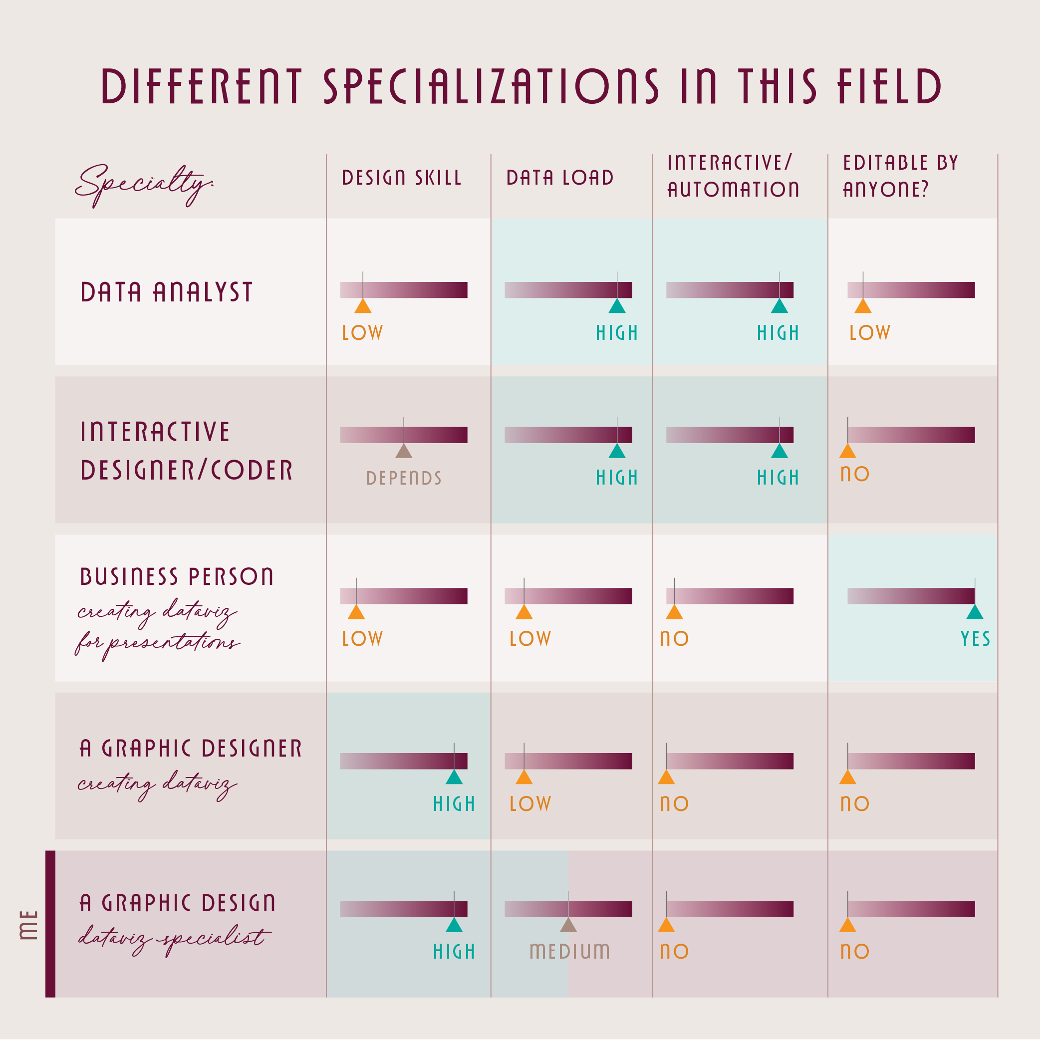
Different specializations in this field
While many people can create data visualizations, in my opinion there are different specializations, skill sets, and/or limitations depending on the designer/creator and their tools and project needs. I have learned to make it very clear what I offer and what I do not, when booking clients and working on projects.
This is how I break it down:
The data analyst dataviz specialist
Some people are what I would call data analyst-heavy dataviz people = they have a higher emphasis on a lot of data and quick, interactive results, and less of a focus on clear and engaging design work. These people often work in Tableau, Power BI, Google data studio, R, etc. I have some experience working in some of these programs, but currently decline any work that requires this. These tools are very limited for designers, and my specialty lies on the more graphic design side. These specialists may have more of a background in data analysis and just need quick tools to visualize their results. I collaborated with many of these people at FCB, and we worked well together because of how we brought different skills to the table.
Skillset/ advantages: They understand the data well, works with a lot of data at once, can create visualizations very quickly/automatically
Tools: Tableau, Power BI, Google data studio
Limitations: Graphic design skillset, customizing charts
The interactive designer/coder dataviz specialist
Coders, interactive designers = similar to the people above, these coders/designers have special skills in working with interactive or changing data and may develop more creative solutions compared to what Tableau or something similar can create.
Skillset/ advantages: interactive design abilities, very customizable
Tools: R, D3, others (I’m not super familiar with them)
Limitations: Ability to customize, some design skills possibly - depending on the person, takes longer than Tableau or other automations
The business person creating dataviz for presentations
People who use powerpoint and excel to create charts and graphs for business presentations. They need these done quickly and need to be editable.
Skillset/ advantages: Can be done quickly and links to excel
Tools: powerpoint, excel
Limitations: Limited ability to customize charts, Not sophisticated design
The graphic designer creating dataviz
Designers who make infographics but don’t have a lot of experience/ expertise in working with data and analytical thinking.
Skillset/ advantages: Design abilities, charts are completely customizable
Tools: Adobe Illustrator, Photoshop, Infogram
Limitations: Lack of analytical understanding, familiarity with dataviz-specific considerations
The graphic designer dataviz specialist (ME)
A graphic designer who is well-versed in both graphic design abilities and analytical skills and familiarity with working with data and creating charts.
Skillset/ advantages: Design abilities, charts are completely customizable, understands how to work with data, emphasize the story
Tools: Adobe Illustrator, Other online tools such as datawrapper, raw graphs, etc.
Limitations: Not interactive/ automatically update-able dataviz, not super quick, not for dashboard, not editable
Here are some tables that help distinguish these specializations.

More about my speciality and who I work with: I have worked with people in each of the categories listed above, to add my expertise and skill set to the work they’ve already done, to improve presentations, or to create visualizations from scratch.
Consider your needs: timing, being editable, interactivity, clarity, design, etc. before deciding who to hire for your project. I do decline projects if I don’t believe it’s a great fit for my skillset and your needs.
my process
I share the basic steps of my design process for future and current clients here
Inquiry & Quote
Gathering information about the project/ understanding the ask
Creating a custom quote or basic package cost
Deposit and initial call
I book projects with a 50% deposit
15-minute inquiry call if needed
Reading content, exploring the data, asking deeper questions
See the section above on data & storytelling
I will take a look at the content usually before booking to make sure I understand the scope and type of data, but will fully dig into it here
Design process
Sketching, designing, bringing in branding elements, etc.
Structuring the charts and then styling them
Note that I do not offer branding design skills or illustrations. I will ask for those assets (fonts, color palettes, logos, other style elements) before getting started.
Editing stage
Providing the initial designs to my client, and receiving feedback
For most quotes I offer 2-3 rounds of revisions, and additional rounds are billed hourly
Final exports are delivered
And the final payment is required
Thank you & reviews
I love receiving reviews from happy clients on my google page.
Here are some further questions and notes I keep in mind during these projects:

Effective dataviz vs. common issues with bad dataviz
Good dataviz:
As I mentioned before, my role as a dataviz designer is to turn plain black and white tables of data or auto-generated charts into impactful and engaging data visualizations. My work makes it easier for people to compare data and understand important insights. Successful data visualization design should be beautiful & practical.
However, there are many examples of bad or problematic data visualizations for a variety of reasons.
Some common issues include:
Information overload
When a design, report, slide, etc. looks completely cluttered and overwhelming
This is a great quote from Tufte: “What about confusing clutter? Information overload? Doesn't data have to be "boiled down" and "simplified"? These common questions miss the point, for the quantity of detail is an issue completely separate from the difficulty of reading. Clutter and confusion are failures of design, not attributes of information.” ― Edward R. Tufte
This is usually a failure of design and storytelling elements. It has become more of a data dump and is usually not very useful or pleasing to the audience.
Dishonest data
Manipulating the data or the chart type (or elements) to distort the information or make it tell a dishonest story
Sometimes client may want this, but I believe that it degrades the integrity of the work.
Un-readable charts
Not including enough context/ information/ or keys so that the chart is un-readable or very hard to distinguish
Tools
Here are some of the tools that I use:
Adobe Illustrator: they have a chart making tool, the most customizable graphic design tool on the market in my opinion
Datawrapper: for maps and some charts styles - no svg/vector export however
Rawgraphs: especially for sankey charts, they are great because they provide vector exports
Google spreadsheets for formatting the data
How companies use data visualizations and infographics
There are various ways that companies can use data visualizations and infographics to enhance their content, offerings, professionalism, and visuals. I have worked with companies to create or enhance: PDF reports, white papers, powerpoint/google slides (I create images that can be dropped into pptx), social media images, blog posts, website graphics, etc.
Basically anywhere you have data or complicated information, design can elevate that content to make it more beautiful and useful.
One of the reasons I love working in data visualization graphic design is that it has so many limitations. Other people might find that constricting but I find it liberating and a fun challenge to tackle. When the content, the text, the story, and the data is fascinating, the design can really help it to shine even more. Orson Welles said: the enemy of art is the absence of limitations and I absolutely agree.

I would love to work with you
Here are links to my portfolio, more about my process, my inquiry form, and my basic dataviz graphic design packages.
I’d love to hear more about your project to see if it would be a good fit to work together!