I strive for designs that make the data & information engaging, exciting, and understandable for the audience. The goal is to reduce the cognitive load for the client/ audience — so that the information speaks clearly the message that we are trying to convey.


Good data visualization design combines these three disciplines:
data + design + storytelling
I am a graphic designer who specializes in telling stories and information with clarity. I received my degree in journalism with a specialization in graphic design and I fell in love with working with data, statistics, and complicated information. I believe that it is an often neglected field of graphic design that needs to be nurtured. I have been working in this niche for over 8 years now. I would love to bring your vision to life!
interested in working together?
Click the link below to fill out my inquiry form.
I look forward to chatting about your next project!
And download my information sheet to learn more about working with me
(process, pricing, what I offer and what is not included in my services):
Here are some examples of my work:


This visual shows the different departments of Solve(d): Media, Data Science, Dataviz, and Marketing Analytics. We wanted to show the capabilities of each group and how we all come together to answer marketing questions about people, the market, and programs that our clients employee for their business.

This is an unbranded example of several monthly reports that I do for our clients. We had longer powerpoint presentations reporting the website analytics for our clients, but then came up with this idea to create an in-depth summary with clear visuals and short 2-3 sentence summaries for each section.


data & design
“Clutter and confusion are failures of design, not attributes of information.” - Edward Tufte
“What about confusing clutter? Information overload? Doesn’t data have to be “boiled down” and “simplified”? These common questions miss the point, for the quantity of detail is an issue completely separate from the difficulty of reading. Clutter and confusion are failures of design, not attributes of information.”
curious about my design process?
More designs from my portfolio:
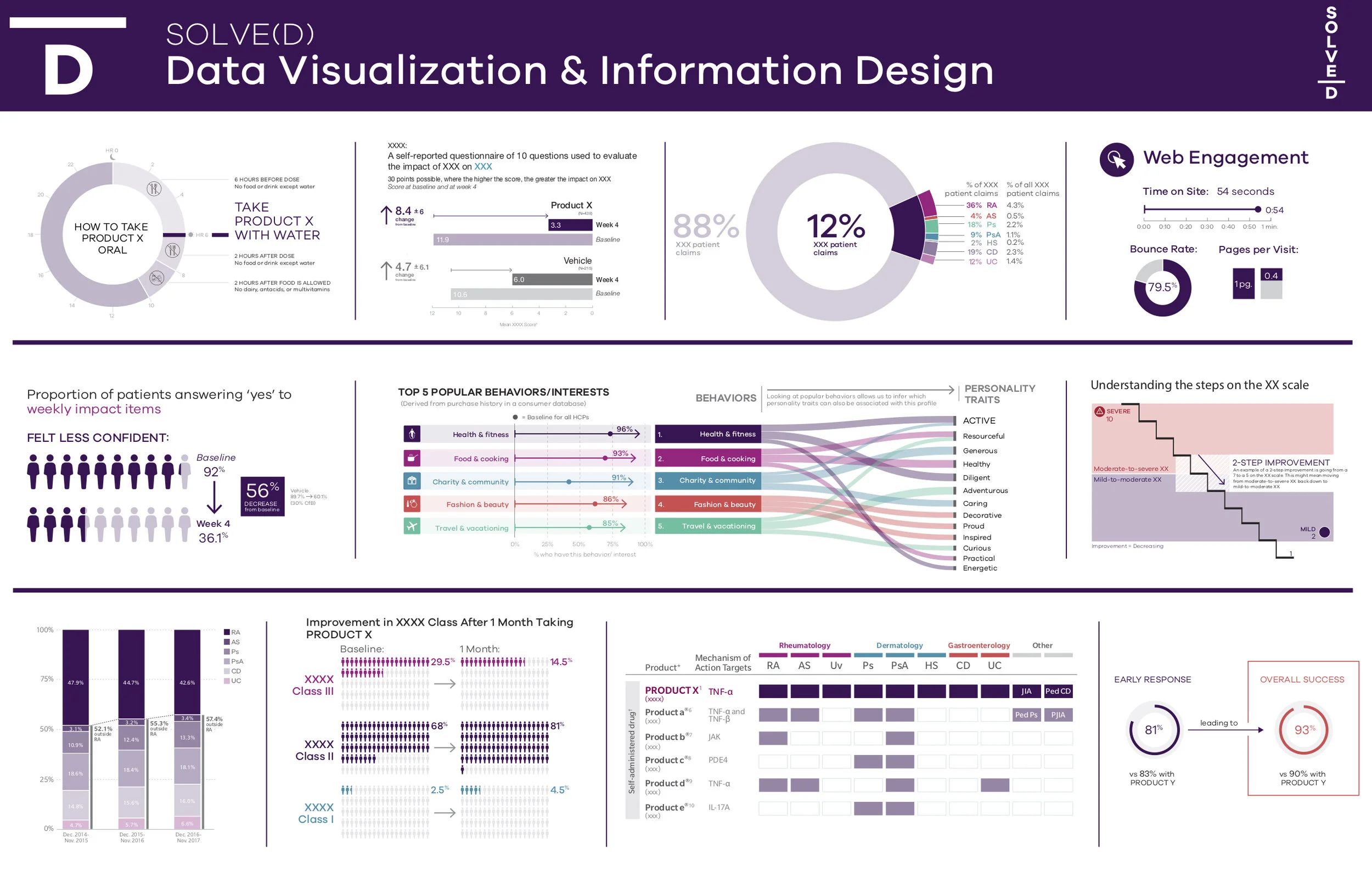
These are a few (blinded) examples of the data visualization work that I did for Solve(d)/ FCB Health. Some of this work was for the analytics team (Solved) and some of it was for the wider FCB Health agency - working with medical data for our pharmaceutical clients. The goal for all of our data visualization work was to make the information easy to comprehend and visually approachable. The clinical data visualizations and infographics include dosing instructions, efficacy results, and patient-reported quality of life ratings.


check out my blog about data visualization design
I also offer other graphic design services including full report designs.
work with me on upwork
Prefer to work on a freelancing platform? I am available for hire on Upwork. Click the link below to view my profile: